Brands Change
Branding decides your next life stage
Brands Change
Brands Change
Brands resemble organisms fighting first to survive, then to prevail in their “ecosystems”: to succeed they must adapt and evolve. Staying true to type and unvarying is good advice when they climb up the market ladder or have attained some measure of success. Down the road, though, change is unavoidable. How could brands possibly know when, how and to what extent they should rebrand themselves?
To change or not to change!
To change or not to change!
For 30 long years we face this challenge with clients handling brands at various life stages, and in different needs to evolve and expand: spin-offs as they mature and reconsider their identity and objectives, manufacturers as they endorse new technologies and prepare to launch new products, non-for-profit organisations as they reintroduce themselves to Millennial and Gen Z audiences. Here are some notable cases each calling for different strategy, measure of change and transition period:

To each their own
To each their own
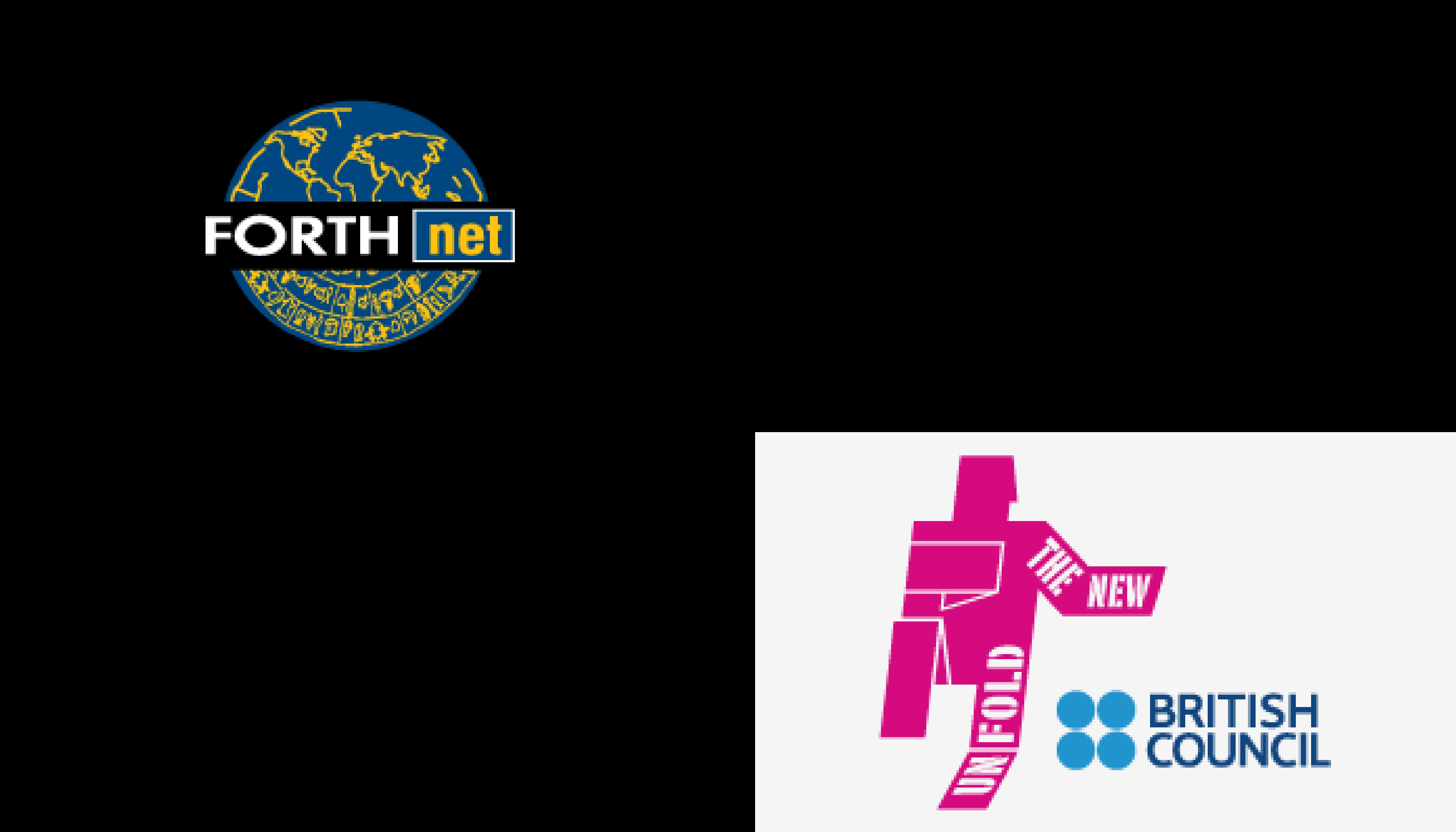
> In 1994, the term Forthnet was used by the Institute of Technology & Research in Crete, Greece (ITE) as a label name for the first ever Greek internet network. Our assignment was to turn it into a brand for the company that soon became the major internet service provider in the country. The Forthnet new logo, visual identity, tone of voice and other promotional guidelines has been our first rebranding project (truth be told, we had no idea of how important that was back then!)
> In 1999, the British Council decided on a long overdue rebranding. In every country where the Council offered the full array of its cultural and educational services, they had to employ design professionals for the transition. In Greece, they picked us, and for a period of two years we designed the new brand applications following the visual identity guidelines laid out in the UK - a priceless lesson, indeed!
> In 2005, it was our turn to trigger a daring rebranding for a dairy farm equipment manufacturer. The company went by the name Inox Centre for 20 years before we met. In that time they had already established a good name as producers of stainless steel cooling tanks, milking parlors and other farm equipment in 10 countries. We helped them see their brand’s weaknesses and change it. Our strategy was to create a dual-business-unit architecture, branded as Milkplan and Inoxplan. In a matter of 18-20 months the rebranding from Inox Centre to Milkplan was complete, and they were on to a very successful global presence.
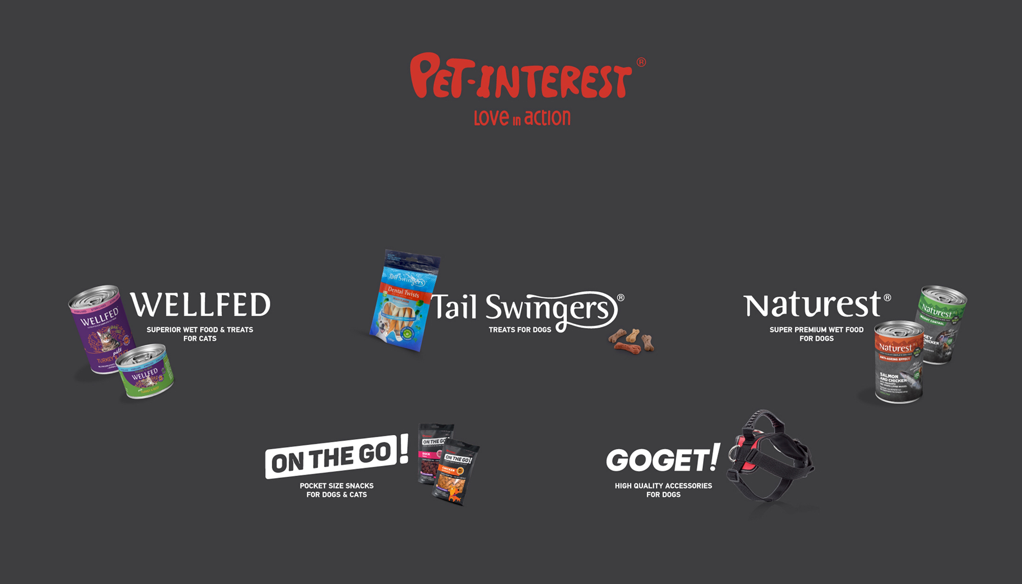
> In 2013, Pet Interest was looking to revamp their pet food packaging and chose Colibri for the task. They had never contemplated a multi-brand architecture for their various product lines mainly because they thought it was too much for their scale and probably unaffordable. Ten years into our collaboration and Pet Interest has become the corporate brand of a firm that owns, handles and promotes consumer brands, such as Wellfed (cat food), Naturest (dog food) or Tail Swingers (dog treats) among others addressing different consumer needs and markets. Their transition from a country level trader to an agile exporter and brand handler has been incremental, in line with their marketing plans and yielding quite a positive ROI. Even in cases where a new product line met with a weak market response, Pet Interest was able to change direction quickly and effectively, due largely to their flexible brand architecture and new business culture.
> In 2015, it was high time for the simulation leader of the automotive world to transfer their know-how to aerospace, medical and other industries. BETA, the world leader in Computer Aided Engineering and a pioneer in the simulation and analysis market (to put it simply, they are the reason why car makers stopped crashing real cars and tried simulation instead!), decided to rebrand themselves. We shouldered the responsibility -from BETA CAE they became BETA Simulation Systems sporting a “Physics on Screen” tag line, a new logo, a new value system, new messages, a new style of presenting themselves, and most of all a renewed enthusiasm for a much deserved future. We keep working together, branding ground-breaking platforms such as Neere, and enjoying their ingenuity and their good humour -good branding depends heavily on these!
We can be of help
We can be of help
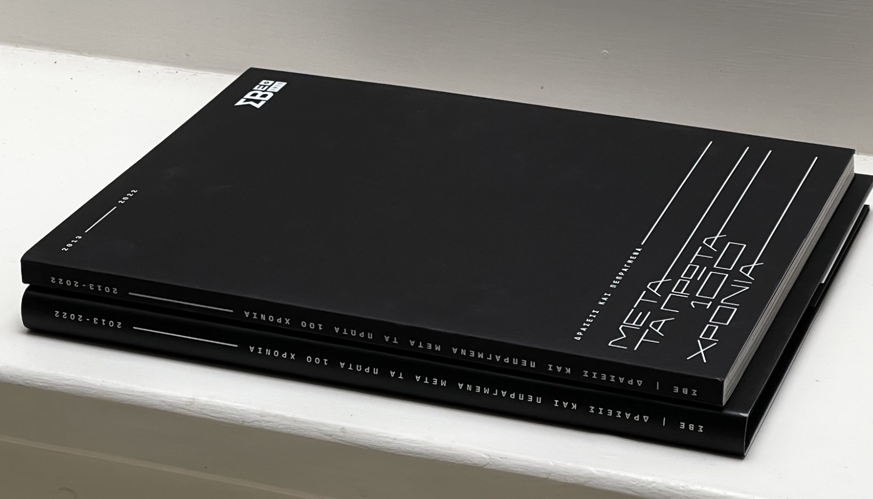
In every rebranding process, sound strategy and clever design are inseparable. The smooth transition from ΣΒΒΕ (SBBE - Federation of Industries of Northern Greece) to ΣΒΕ (SBE - Federation of Industries of Greece), on their 100-year anniversary was a carefully orchestrated transition we had anticipated with the new logo design -very few people can now tell when exactly the extra “B” went missing!
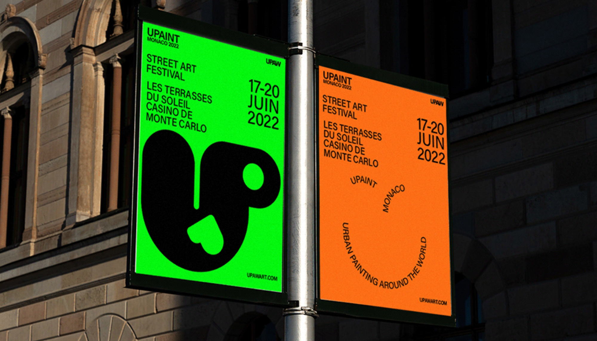
Discretion, however, in not always the way forward. “UPaint” may sound similar to the “UPAW” it replaced, but it certainly looks and feels different to the street art enthusiasts visiting Monte Carlo, Monaco, for this truly rare art event. “Accordia” is another rather straightforward declaration of change by a leading manufacturer of cables with an international outlook. To choose when, how and to what extent your brand should change, you need expertise and experience in equal measure. We can be of help!