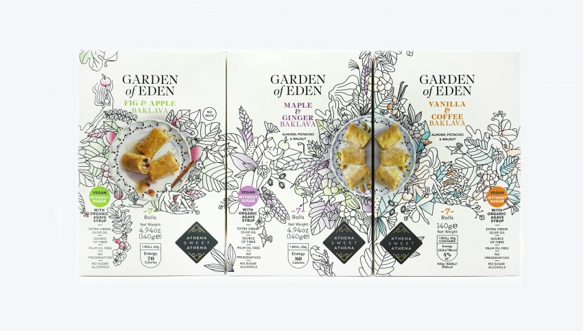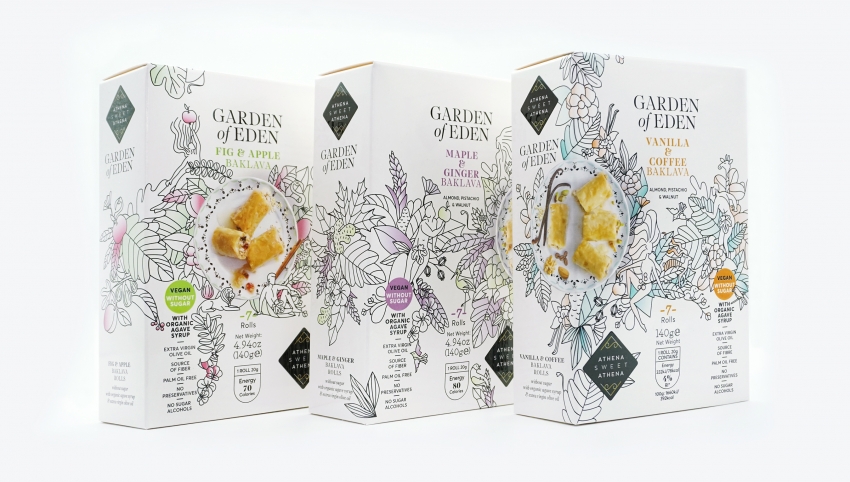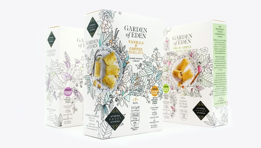
“Heavenly!” – this is the desirable (and indeed feasible after three series of tasting and market testing) impression we want from consumer experience. The target here is the younger generation of consumers who are not familiar with baklava as an Eastern traditional product and respond to claims like sugar free, low fat, no fiber, no sugar alcohols, no preservatives, organic, vegan. The packaging must be suitable for a S/M shelf, which would allow for at least two or three flavours and distance itself from the over ornated character of Baklava from Turkey and the Middle East.
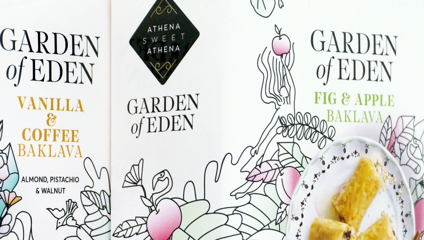
Handmade, image and product, to communicate the artisanal dimension of a sweet that is in principle exotic to the markets it is imported to. Garden themes with distinctive visual references to flavours such as the apple of Eve and Adam’s fig leaf, Apple & Apricot or flowers and fruits for Vanilla & Coffee. The mandatory (from buyers and prospective consumers of new products) photographic image is “implemented” on the plate with the outline illustrated to bridge the two techniques. The positions of the photographs vary: central for No Nuts, (only fruit for those who have difficulty digesting dried fruits), on the side and cropped for the other two flavours that can be placed together composing a new double image. On the highly loaded package, the position of the claims is important: under the primary and strongly distinct “without sugar” and next to the nutritional information intentionally chosen for the front face.