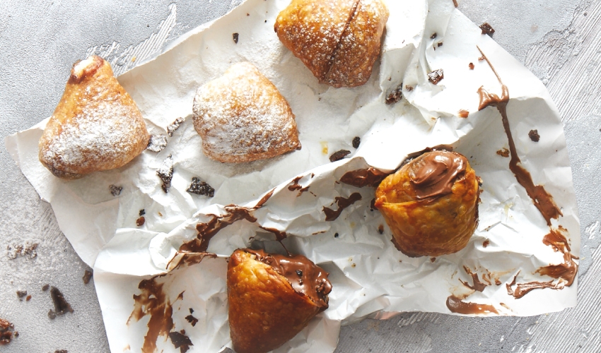
The branding challenge was how to make a quality pie range stand out above the rest; to distance it from the small scale, rustic image associated with the everyday pie shop, while still communicating an attractive, wholesome well-known food product. The brand name, Pie Sense, communicates a clear, clean modern and a confident image matching also the daring pie tastes that the brand is beginning to develop, which have never been attempted before.
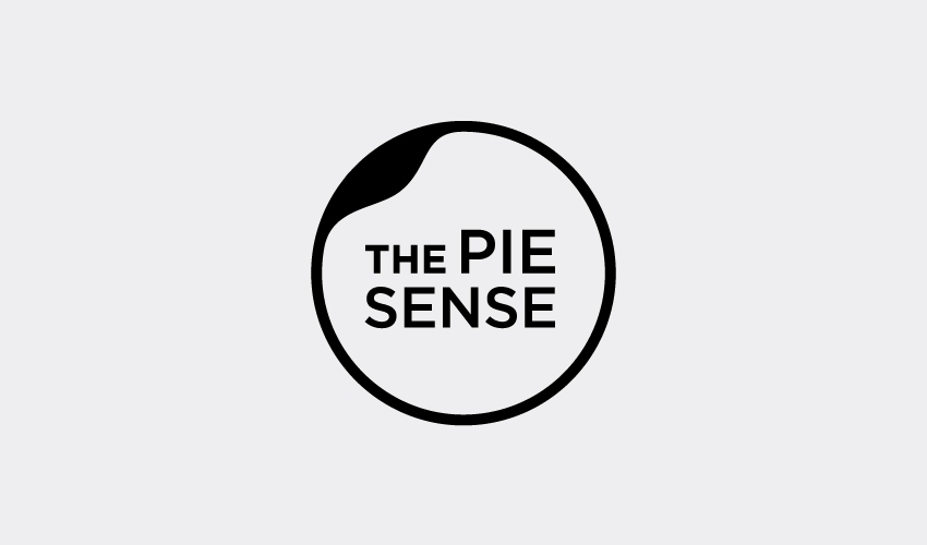
The second part of the solution was to create a clean smart logo that communicates gourmet and elegance for its smart quality, but also originality, and to allude to the most important ingredient to get right in Greek pies - the phyllo pastry. The logo’s subtle up turn in the top left corner, does just this, causing the viewer to see the logo not just as a clean background but also as if looking down on phyllo pastry, and emphasising its dynamic quality to be moulded and crafted.
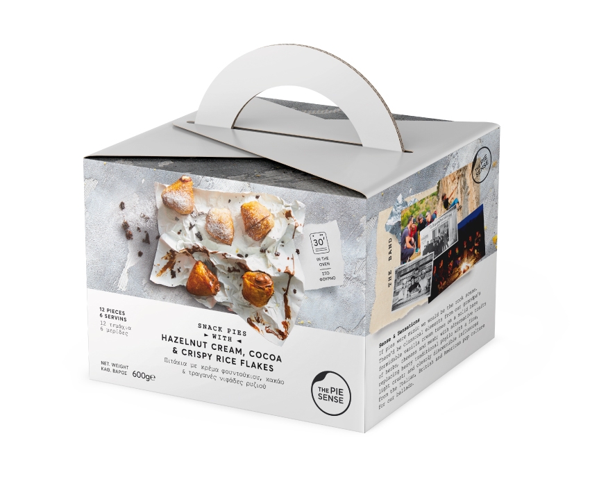
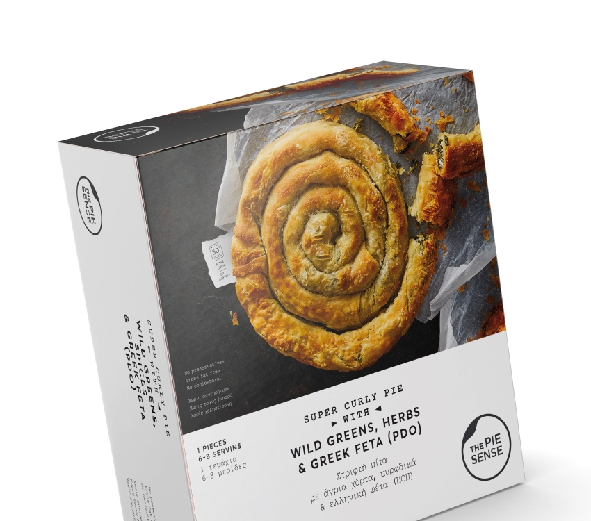
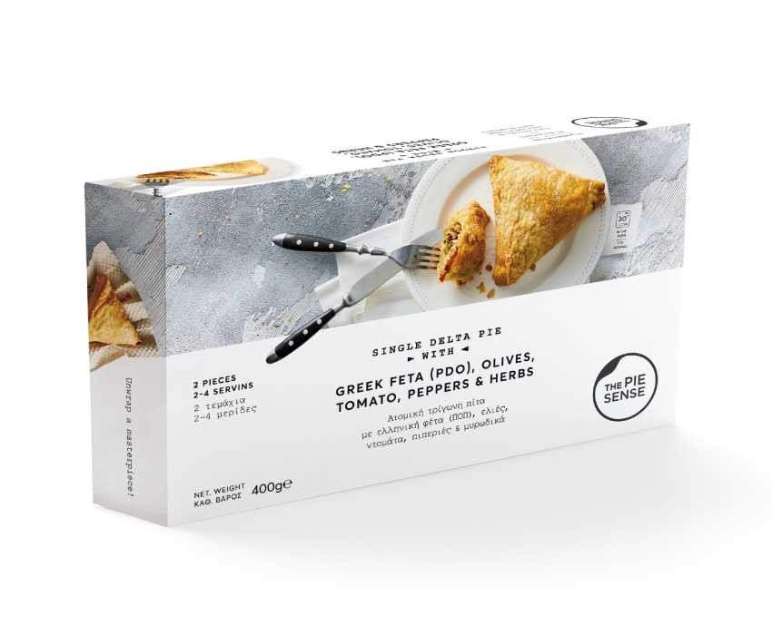
The packaging was designed to match the name and logo in originality and to stand out as a smart modern and new way to carry around pies worth taking the time to enjoy.